Executive Dashboard
Those are this report's own sheets, printed by the engine from the template and the payload below — not screenshots kept beside them.
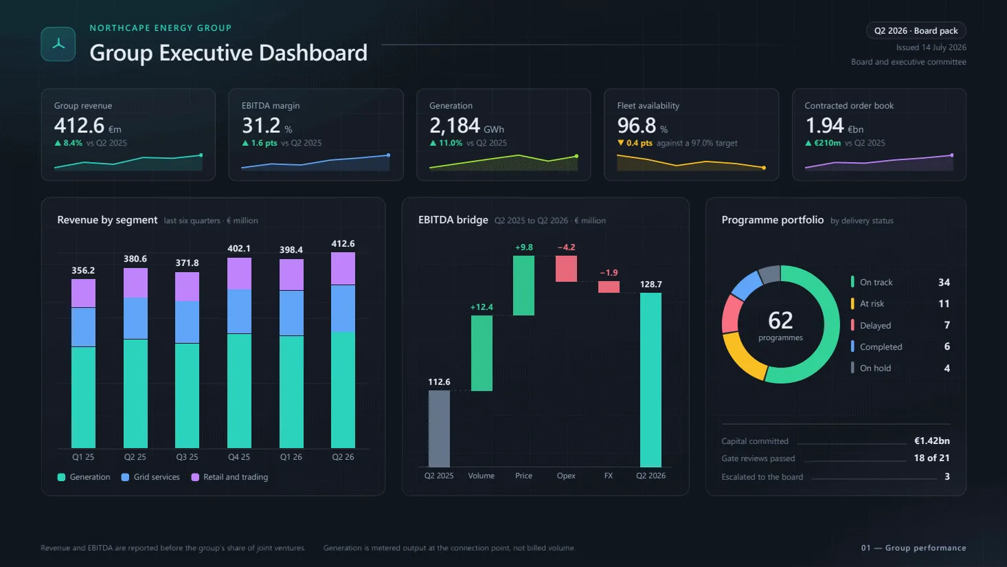
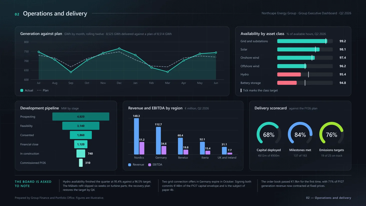
The source
This is the whole thing — the template, the pages that print from it, and the stylesheet
they are dressed in, as HTML with {{ }} bindings. Nothing is generated from a
designer format; what you see here is what the engine renders.
template.html
<!DOCTYPE html>
<html>
<head>
<meta charset="utf-8">

<link rel="stylesheet" href="assets/css/report.css">

<script src="assets/js/charts.js"></script>

</head>
<body>

<script id="report-data" type="application/json">{{json}}</script>

<template id="report-header"></template>
<template id="report-footer"></template>

</body>
</html>
page1.html
<div class="slide">
<header class="masthead">
<span class="mark">
<svg width="21" height="21" viewBox="0 0 20 20" fill="none" aria-hidden="true">
<path d="M10 9.4V2.8" stroke="currentColor" stroke-width="1.7" stroke-linecap="round"/>
<path d="M9.1 10.5 3.4 13.8" stroke="currentColor" stroke-width="1.7" stroke-linecap="round"/>
<path d="M10.9 10.5l5.7 3.3" stroke="currentColor" stroke-width="1.7" stroke-linecap="round"/>
<circle cx="10" cy="9.8" r="1.6" fill="currentColor"/>
</svg>
</span>
<div class="titles">
<span class="eyebrow">{{report.org}}</span>
<h1>{{report.title}}</h1>
</div>
<span class="keyline"></span>
<div class="stamp">
<span class="period">{{report.period}} · {{report.edition}}</span>
<span class="aside">Issued {{date report.issuedOn "d MMMM yyyy" "en-GB"}}</span>
<span class="aside">{{report.classification}}</span>
</div>
</header>
<section class="kpis">
{{#each kpis}}
<article class="kpi {{#if good}}kpi--good{{else}}kpi--watch{{/if}}">
<span class="kpi-label">{{label}}</span>
<span class="kpi-figure">
<span class="value">{{number value format "en-US"}}</span>
<span class="unit">{{unit}}</span>
</span>
<span class="kpi-delta">
<span class="change">{{#if (eq direction "up")}}▲{{else}}▼{{/if}} {{delta}}</span>
<span class="caption">{{caption}}</span>
</span>
<div class="spark" data-chart="spark" data-source="kpis.{{@index}}"></div>
</article>
{{/each}}
</section>
<div class="panels panels--summary">
<section class="card">
<div class="card-head">
<h2>{{revenue.title}}</h2>
<span class="qualifier">{{revenue.qualifier}} · {{revenue.unit}}</span>
</div>
<div class="card-body">
<div class="chart" data-chart="stacked" data-source="revenue"></div>
</div>
<div class="keys">
{{#each revenue.series}}
<span class="key"><span class="swatch" style="background: {{colour}}"></span>{{name}}</span>
{{/each}}
</div>
</section>
<section class="card">
<div class="card-head">
<h2>{{bridge.title}}</h2>
<span class="qualifier">{{bridge.qualifier}} · {{bridge.unit}}</span>
</div>
<div class="card-body">
<div class="chart" data-chart="waterfall" data-source="bridge"></div>
</div>
</section>
<section class="card">
<div class="card-head">
<h2>{{portfolio.title}}</h2>
<span class="qualifier">{{portfolio.qualifier}}</span>
</div>
<div class="card-body">
<div class="donut" data-chart="donut" data-source="portfolio.segments">
<div class="middle">
<span class="figure">{{number portfolio.total "N0" "en-US"}}</span>
<span class="unit">{{portfolio.unit}}</span>
</div>
</div>
<div class="legend">
{{#each portfolio.segments}}
<div class="legend-row">
<span class="tick" style="background: {{colour}}"></span>
<span class="label">{{label}}</span>
<span class="figure">{{number value "N0" "en-US"}}</span>
</div>
{{/each}}
</div>
</div>
<div class="notes">
{{#each portfolio.notes}}
<div class="note-row">
<span class="label">{{label}}</span>
<span class="leader"></span>
<span class="value">{{value}}</span>
</div>
{{/each}}
</div>
</section>
</div>
<footer class="footnotes">
<div class="marks">
{{#each footnotes}}<p>{{this}}</p>{{/each}}
</div>
<p class="folio">01 — Group performance</p>
</footer>
</div>
page2.html
<div class="slide">
<header class="masthead masthead--slim">
<h2><span class="index">02</span> Operations and delivery</h2>
<span class="keyline"></span>
<span class="running">{{report.org}} · {{report.title}} · {{report.period}}</span>
</header>
<div class="panels panels--wide">
<section class="card">
<div class="card-head">
<h2>{{generation.title}}</h2>
<span class="qualifier">{{generation.qualifier}} · {{generation.note}}</span>
</div>
<div class="card-body">
<div class="chart" data-chart="line" data-source="generation"></div>
</div>
<div class="keys">
{{#each generation.series}}
<span class="key">
{{#if dashed}}
<span class="dash" style="color: {{colour}}"></span>
{{else}}
<span class="swatch" style="background: {{colour}}"></span>
{{/if}}{{name}}
</span>
{{/each}}
</div>
</section>
<section class="card">
<div class="card-head">
<h2>{{availability.title}}</h2>
<span class="qualifier">{{availability.qualifier}}</span>
</div>
<div class="card-body">
<div class="chart" data-chart="bars" data-source="availability"></div>
</div>
<div class="keys">
<span class="key"><span class="pin"></span>{{availability.legend}}</span>
</div>
</section>
</div>
<div class="panels panels--three">
<section class="card">
<div class="card-head">
<h2>{{pipeline.title}}</h2>
<span class="qualifier">{{pipeline.qualifier}}</span>
</div>
<div class="card-body">
<div class="chart" data-chart="funnel" data-source="pipeline.stages"></div>
</div>
</section>
<section class="card">
<div class="card-head">
<h2>{{regions.title}}</h2>
<span class="qualifier">{{regions.qualifier}}</span>
</div>
<div class="card-body">
<div class="chart" data-chart="grouped" data-source="regions"></div>
</div>
<div class="keys">
{{#each regions.series}}
<span class="key"><span class="swatch" style="background: {{colour}}"></span>{{name}}</span>
{{/each}}
</div>
</section>
<section class="card">
<div class="card-head">
<h2>{{scorecard.title}}</h2>
<span class="qualifier">{{scorecard.qualifier}}</span>
</div>
<div class="dials">
{{#each scorecard.dials}}
<div class="dial">
<div class="ring" data-chart="gauge" data-source="scorecard.dials.{{@index}}">
<span class="middle">{{number value "N0" "en-US"}}%</span>
</div>
<span class="name">{{label}}</span>
<span class="caption">{{caption}}</span>
</div>
{{/each}}
</div>
</section>
</div>
<section class="decisions">
<h3>{{decisions.title}}</h3>
<ul>
{{#each decisions.items}}<li>{{this}}</li>{{/each}}
</ul>
</section>
<footer class="footnotes footnotes--slim">
<div class="marks">
<p>{{source}}</p>
</div>
<p class="folio">02 — Operations and delivery</p>
</footer>
</div>
assets/css/report.css
:root
{
  /* The deck's palette, named by what it is used for rather than by its hue. */
  --ink: #e9eef6;
  --ink-soft: #9db0c8;
  --ink-faint: #6d7f98;

  --surface: rgba(255, 255, 255, .045);
  --surface-lift: rgba(255, 255, 255, .075);
  --edge: rgba(255, 255, 255, .10);
  --rule: rgba(255, 255, 255, .13);

  --teal: #2dd4bf;
  --blue: #60a5fa;
  --violet: #c084fc;
  --lime: #a3e635;
  --amber: #fbbf24;
  --rose: #fb7185;
  --slate: #64748b;
}

/*
  The field the whole deck sits on. It is on the root element and not on a box of its own because a
  background paints where its box reaches and stops there: CSS propagates this one to the canvas,
  and the canvas is every sheet the page prints onto, whatever the content does to its height.

  Four layers, back to front: the flat base, a cool wash from the top-left, a violet one from the
  bottom-right, and a hairline grid that gives the dark field a scale without being a texture you
  can name at reading distance.
*/
html
{
  background-color: #0b1017;
  background-image:
    repeating-linear-gradient(0deg, rgba(255, 255, 255, .022) 0 1px, transparent 1px 48px),
    repeating-linear-gradient(90deg, rgba(255, 255, 255, .022) 0 1px, transparent 1px 48px),
    radial-gradient(900px 520px at 8% -14%, rgba(45, 212, 191, .16), transparent 62%),
    radial-gradient(820px 500px at 104% 116%, rgba(129, 140, 248, .20), transparent 64%),
    linear-gradient(168deg, #101724 0%, #0c1119 52%, #090c12 100%);
}

body
{
  margin: 0;
  color: var(--ink);
  font-family: "Segoe UI", system-ui, sans-serif;
  font-size: 12px;
  line-height: 1.4;

  font-variant-numeric: tabular-nums;
}

.slide
{
  width: 1280px;
  height: 720px;
  box-sizing: border-box;
  padding: 0 52px;
  overflow: hidden;
}

/* ---------- masthead ---------- */

.masthead
{
  height: 112px;
  display: flex;
  align-items: center;
  gap: 18px;
}

.mark
{
  flex: 0 0 auto;
  display: grid;
  place-items: center;
  width: 42px;
  height: 42px;
  border-radius: 11px;
  border: 1px solid rgba(45, 212, 191, .38);
  background: linear-gradient(150deg, rgba(45, 212, 191, .22), rgba(96, 165, 250, .14));
  color: var(--teal);
}

.titles
{
  display: flex;
  flex-direction: column;
  gap: 3px;
}

.eyebrow
{
  color: var(--teal);
  font-size: 11px;
  font-weight: 600;
  letter-spacing: .14em;
  text-transform: uppercase;
}

.masthead h1
{
  margin: 0;
  font-size: 29px;
  font-weight: 600;
  letter-spacing: -.015em;
}

/* The keyline that runs off to the far side of the title, as on the deck's section heads. */
.masthead .keyline
{
  flex: 1;
  height: 1px;
  background: linear-gradient(to right, rgba(255, 255, 255, .16), rgba(255, 255, 255, 0));
}

.stamp
{
  display: flex;
  flex-direction: column;
  align-items: flex-end;
  gap: 3px;
  text-align: end;
  white-space: nowrap;
}

.stamp .period
{
  padding: 3px 10px;
  border: 1px solid var(--edge);
  border-radius: 999px;
  background: var(--surface);
  font-size: 11px;
  font-weight: 600;
}

.stamp .aside
{
  color: var(--ink-faint);
  font-size: 10.5px;
}

/* The second slide carries the title as a running head rather than restating it. */
.masthead--slim
{
  height: 92px;
}

.masthead--slim h2
{
  display: flex;
  align-items: baseline;
  gap: 12px;
  margin: 0;
  font-size: 21px;
  font-weight: 600;
  letter-spacing: -.01em;
}

.masthead--slim .index
{
  color: var(--teal);
  font-size: 12px;
  font-weight: 700;
  letter-spacing: .12em;
}

.masthead--slim .running
{
  color: var(--ink-faint);
  font-size: 11px;
  white-space: nowrap;
}

/* ---------- the headline figures ---------- */

.kpis
{
  display: grid;
  grid-template-columns: repeat(5, 1fr);
  gap: 16px;
  height: 118px;
}

.kpi
{
  position: relative;
  box-sizing: border-box;
  display: flex;
  flex-direction: column;
  gap: 2px;
  padding: 13px 16px 12px;
  border: 1px solid var(--edge);
  border-radius: 10px;
  background: var(--surface);
  overflow: hidden;
}

.kpi-label
{
  color: var(--ink-soft);
  font-size: 11px;
  letter-spacing: .01em;

  overflow: hidden;
  text-overflow: ellipsis;
  white-space: nowrap;
}

.kpi-figure
{
  display: flex;
  align-items: baseline;
  gap: 5px;
}

.kpi-figure .value
{
  font-size: 27px;
  font-weight: 600;
  line-height: 1.05;
  letter-spacing: -.02em;
}

.kpi-figure .unit
{
  color: var(--ink-soft);
  font-size: 12px;
}

.kpi-delta
{
  display: flex;
  align-items: center;
  gap: 5px;
  font-size: 10.5px;
}

.kpi-delta .change
{
  font-weight: 700;
}

.kpi--good .change { color: #34d399; }
.kpi--watch .change { color: var(--amber); }

.kpi-delta .caption
{
  color: var(--ink-faint);

  overflow: hidden;
  text-overflow: ellipsis;
  white-space: nowrap;
}

.kpi .spark
{
  height: 24px;
  margin-top: auto;
}

/* ---------- cards ---------- */

.panels
{
  display: grid;
  gap: 20px;
}

.panels--summary
{
  grid-template-columns: 1.32fr 1.1fr 1fr;
  height: 380px;
  margin-top: 20px;
}

.panels--wide
{
  grid-template-columns: 1.85fr 1fr;
  height: 244px;
}

.panels--three
{
  grid-template-columns: 1fr 1.18fr 1fr;
  height: 244px;
  margin-top: 16px;
}

/*
  A column, so the chart inside takes whatever height is left once the heading and the key row have
  had theirs. The charts measure the box they are drawn into, and a card that instead gave its body
  a fixed height would push the keys off the bottom of every card that has them.
*/
.card
{
  position: relative;
  box-sizing: border-box;
  display: flex;
  flex-direction: column;
  height: 100%;
  padding: 14px 18px 12px;
  border: 1px solid var(--edge);
  border-radius: 12px;
  background: var(--surface);
  overflow: hidden;
}

/* The lit top edge. It is what separates one card from the field behind it without a hard border. */
.card::before
{
  content: "";
  position: absolute;
  top: 0;
  left: 16px;
  right: 16px;
  height: 1px;
  background: linear-gradient(to right, rgba(255, 255, 255, 0), var(--surface-lift), rgba(255, 255, 255, 0));
}

.panels--summary .card
{
  padding: 18px 20px 16px;
}

.card-head
{
  display: flex;
  align-items: baseline;
  gap: 8px;
  min-height: 20px;
}

.card-head h2
{
  margin: 0;
  font-size: 13.5px;
  font-weight: 600;
  white-space: nowrap;
}

/* The quiet half of a heading — the "last six quarters" that follows the subject. */
.card-head .qualifier
{
  flex: 1;
  min-width: 0;
  color: var(--ink-faint);
  font-size: 10.5px;

  overflow: hidden;
  text-overflow: ellipsis;
  white-space: nowrap;
}

.card-body
{
  flex: 1;
  display: flex;
  align-items: stretch;
  gap: 14px;
  min-height: 0;
  margin-top: 6px;
}

.panels--summary .card-body
{
  margin-top: 10px;
}

.chart
{
  flex: 1;
  min-width: 0;
}

.chart svg
{
  display: block;
  width: 100%;
  height: 100%;
}

/* ---------- keys ---------- */

.keys
{
  display: flex;
  flex-wrap: wrap;
  gap: 6px 14px;
  margin-top: 8px;
}

.key
{
  display: flex;
  align-items: center;
  gap: 6px;
  color: var(--ink-soft);
  font-size: 10.5px;
}

.key .swatch
{
  width: 10px;
  height: 10px;
  border-radius: 3px;
}

.key .dash
{
  width: 14px;
  height: 0;
  border-top: 1.6px dashed currentColor;
}

.key .pin
{
  width: 2px;
  height: 12px;
  background: var(--ink);
}

/* ---------- donut and its legend ---------- */

.donut
{
  flex: 0 0 auto;
  align-self: center;
  position: relative;
  width: 150px;
  height: 150px;
}

.donut svg
{
  display: block;
}

.donut .middle
{
  position: absolute;
  inset: 0;
  display: flex;
  flex-direction: column;
  align-items: center;
  justify-content: center;
  gap: 1px;
}

.donut .middle .figure
{
  font-size: 30px;
  font-weight: 600;
  line-height: 1;
  letter-spacing: -.02em;
}

.donut .middle .unit
{
  color: var(--ink-soft);
  font-size: 10px;
}

.legend
{
  flex: 1;
  display: flex;
  flex-direction: column;
  justify-content: center;
  gap: 9px;
  min-width: 0;
}

.legend-row
{
  display: flex;
  align-items: center;
  gap: 8px;
}

.legend-row .tick
{
  flex: 0 0 auto;
  width: 4px;
  height: 15px;
  border-radius: 2px;
}

.legend-row .label
{
  flex: 1;
  min-width: 0;
  color: var(--ink-soft);
  font-size: 11px;

  overflow: hidden;
  text-overflow: ellipsis;
  white-space: nowrap;
}

.legend-row .figure
{
  flex: 0 0 auto;
  font-size: 13px;
  font-weight: 700;
}

/* The two lines under the portfolio ring — the facts the ring itself cannot carry. */
.notes
{
  display: flex;
  flex-direction: column;
  gap: 6px;
  margin-top: 12px;
  padding-top: 12px;
  border-top: 1px solid var(--edge);
}

.note-row
{
  display: flex;
  align-items: baseline;
  gap: 10px;
}

.note-row .label
{
  color: var(--ink-faint);
  font-size: 10.5px;
  white-space: nowrap;
}

.note-row .leader
{
  flex: 1;
  height: 1px;
  background: var(--edge);
}

.note-row .value
{
  font-size: 12px;
  font-weight: 700;
}

/* ---------- delivery dials ---------- */

.dials
{
  flex: 1;
  display: flex;
  align-items: center;
  justify-content: space-between;
  gap: 10px;
  min-height: 0;
  margin-top: 6px;
}

.dial
{
  flex: 1;
  display: flex;
  flex-direction: column;
  align-items: center;
  gap: 4px;
  min-width: 0;
}

.dial .ring
{
  position: relative;
  width: 86px;
  height: 86px;
}

.dial .ring svg
{
  display: block;
}

.dial .ring .middle
{
  position: absolute;
  inset: 0;
  display: grid;
  place-items: center;
  font-size: 21px;
  font-weight: 600;
  letter-spacing: -.02em;
}

.dial .name
{
  color: var(--ink);
  font-size: 11px;
  font-weight: 600;
  text-align: center;
}

.dial .caption
{
  color: var(--ink-faint);
  font-size: 10px;
  text-align: center;
}

/* ---------- what the slide asks the reader to do ---------- */

.decisions
{
  box-sizing: border-box;
  display: flex;
  align-items: flex-start;
  gap: 22px;
  height: 62px;
  margin-top: 16px;
  padding-top: 14px;
  border-top: 1px solid var(--edge);
}

.decisions h3
{
  flex: 0 0 132px;
  margin: 0;
  color: var(--teal);
  font-size: 11px;
  font-weight: 600;
  letter-spacing: .1em;
  text-transform: uppercase;
}

.decisions ul
{
  flex: 1;
  display: grid;
  grid-template-columns: repeat(3, 1fr);
  gap: 18px;
  margin: 0;
  padding: 0;
  list-style: none;
}

.decisions li
{
  padding-left: 12px;
  border-left: 2px solid var(--edge);
  color: var(--ink-soft);
  font-size: 10px;
  line-height: 1.45;
}

/* ---------- footnotes ---------- */

.footnotes
{
  display: flex;
  align-items: flex-end;
  justify-content: space-between;
  gap: 24px;
  height: 72px;
  padding-bottom: 16px;
  color: var(--ink-faint);
  font-size: 10px;
}

/*
  The second slide spends more of its height on cards, so its footer is what is left: 24px of box
  and the rest as the margin under the type. The two numbers have to add up to what the rows above
  leave free — a taller box here does not push the type down, it pushes the padding off the sheet
  and the line ends up printed against the bottom edge.
*/
.footnotes--slim
{
  height: 24px;
  padding-bottom: 22px;
}

.footnotes p
{
  margin: 0;
}

.footnotes .marks
{
  display: flex;
  gap: 22px;
  max-width: 820px;
}

.footnotes .folio
{
  flex: 0 0 auto;
  color: var(--ink-soft);
  font-weight: 600;
  letter-spacing: .08em;
  white-space: nowrap;
}
shared-assets/css/house.css
/*
  The project's house style: what every report in it looks like before it looks like itself.

  It is in shared-assets rather than in a report because it is the project's, not one report's —
  the palette, the type, the sheet, the running header, and the handful of parts (card, chip, pill,
  meter, table) that every report here is assembled from. A report's own stylesheet composes these
  into its layout; it does not redecide what a card is.

  A template references it as assets/css/house.css, exactly as it references its own files. The
  shared folder is searched behind the report's own, so the path means the same thing in every
  report — and a report that needs its own version keeps a file at that path and wins.
*/

:root
{
  /* Named for the job, not the hue, so a rebrand is this block and nothing else. */
  --ink: #0f172a;
  --ink-soft: #475569;
  --ink-faint: #6b7a90;
  --ink-invert: #ffffff;

  --page: #ffffff;
  --panel: #ffffff;
  --panel-2: #f8fafc;
  --rule: #e2e8f0;
  --rule-soft: #eef2f7;

  --brand: #0b1f3a;
  --brand-2: #12325c;
  --accent: #1d4ed8;
  --accent-soft: #eef3ff;
  --cyan: #0ea5e9;

  --good: #047857;
  --good-soft: #e7f6f0;
  --warn: #b45309;
  --warn-soft: #fdf3e3;
  --bad: #b91c1c;
  --bad-soft: #fdeceb;
  --idle: #64748b;
  --idle-soft: #f1f5f9;

  --radius: 7px;
  --radius-sm: 4px;
}

body
{
  margin: 0;
  color: var(--ink);
  background: var(--page);

  /*
    No Arabic face here, and no Arabic font in shared-assets at all. Naming one for every report in
    the project meant seven reports asked for a typeface none of them loads, so what they actually
    printed in was the second name in the list. The one Arabic report carries the family and the
    files itself.
  */
  font-family: "Segoe UI", Tahoma, sans-serif;
  font-size: 11px;
  line-height: 1.55;

  /* Every figure in this project is read down a column, so digits are the same width. */
  font-variant-numeric: tabular-nums;
  -webkit-font-smoothing: antialiased;
}

/*
  The sheet.

  The engine prints with no page margin, so the edges are the report's own to leave. Cloned decoration
  keeps the padding on every sheet a long page runs onto rather than only the first, and the top
  padding is what the fixed running header sits in — it reserves no room of its own.
*/
.sheet
{
  box-sizing: border-box;
  width: 794px;
  min-height: 1123px;
  padding: 96px 40px 44px;

  -webkit-box-decoration-break: clone;
  box-decoration-break: clone;
}

/* ---------- the running header, on every sheet ---------- */

/*
  The engine fixes #report-page-header to the top of the sheet; everything below is this project's
  band inside it. A band rather than a line of text: it is the first thing on every page and the
  only thing carrying the mark, and at 76px it is still under a fifteenth of the sheet.
*/
#report-page-header
{
  height: 76px;
  background: linear-gradient(105deg, var(--brand) 0%, var(--brand-2) 62%, #17416f 100%);
  color: var(--ink-invert);
}

.masthead
{
  display: flex;
  align-items: center;
  gap: 14px;
  height: 73px;
  padding: 0 40px;
  box-sizing: border-box;
}

/* The accent edge, under the band. Three pixels is enough to read as deliberate. */
#report-page-header::after
{
  content: "";
  display: block;
  height: 3px;
  background: linear-gradient(to left, var(--accent), var(--cyan) 55%, rgba(14, 165, 233, 0));
}

.masthead .logo
{
  width: 30px;
  height: 30px;
  flex: 0 0 auto;
}

.masthead .titles
{
  display: flex;
  flex-direction: column;
  gap: 1px;
  min-width: 0;
}

.masthead .org
{
  font-size: 12.5px;
  font-weight: 700;
  letter-spacing: -.005em;
}

.masthead .subject
{
  font-size: 10.5px;
  color: #a9c2e0;
}

.masthead .meta
{
  margin-inline-start: auto;
  display: flex;
  flex-direction: column;
  align-items: flex-end;
  gap: 2px;
  text-align: end;
  white-space: nowrap;
}

.masthead .period
{
  font-size: 11px;
  font-weight: 600;
}

/* A quiet outline rather than a filled badge: it is a caveat, not a headline. */
.masthead .classification
{
  padding: 1px 7px;
  border: 1px solid rgba(255, 255, 255, .34);
  border-radius: 999px;
  font-size: 9px;
  color: #cddcee;
}

/* ---------- the page's own heading, under the band ---------- */

.pagehead
{
  display: flex;
  align-items: flex-end;
  gap: 12px;
  padding-bottom: 9px;
  border-bottom: 1px solid var(--rule);
}

.pagehead h1
{
  margin: 0;
  font-size: 19px;
  font-weight: 700;
  letter-spacing: -.015em;
}

.pagehead .lede
{
  margin: 3px 0 0;
  color: var(--ink-soft);
  font-size: 10.5px;
}

.pagehead .stamp
{
  margin-inline-start: auto;
  color: var(--ink-faint);
  font-size: 10px;
  white-space: nowrap;
}

/* ---------- parts ---------- */

.card
{
  box-sizing: border-box;
  padding: 12px 14px 10px;
  background: var(--panel);
  border: 1px solid var(--rule);
  border-radius: var(--radius);
}

.card-head
{
  display: flex;
  align-items: baseline;
  gap: 8px;
  margin-bottom: 8px;
}

.card h2
{
  margin: 0;
  font-size: 12.5px;
  font-weight: 700;
}

.card .note
{
  margin-inline-start: auto;
  color: var(--ink-faint);
  font-size: 9.5px;
  white-space: nowrap;
}

/* A chart draws itself left to right whatever the page does, and its own labels sit inside it. */
.chart
{
  width: 100%;
  direction: ltr;
}

.chip
{
  display: inline-flex;
  align-items: center;
  gap: 4px;
  padding: 1px 7px;
  border-radius: 999px;
  font-size: 9.5px;
  font-weight: 700;
  line-height: 1.7;
  white-space: nowrap;
}

.chip--good { background: var(--good-soft); color: var(--good); }
.chip--bad  { background: var(--bad-soft);  color: var(--bad); }
.chip--warn { background: var(--warn-soft); color: var(--warn); }
.chip--idle { background: var(--idle-soft); color: var(--idle); }

/*
  A status, as a word with a dot rather than as a filled block: eight of them down a table column
  would otherwise be eight blocks of colour competing with the figures beside them.
*/
.pill
{
  display: inline-flex;
  align-items: center;
  gap: 5px;
  font-size: 10px;
  font-weight: 600;
  white-space: nowrap;
}

.pill::before
{
  content: "";
  width: 7px;
  height: 7px;
  border-radius: 50%;
  background: currentColor;
  flex: 0 0 auto;
}

.pill--good { color: var(--good); }
.pill--warn { color: var(--warn); }
.pill--bad  { color: var(--bad); }
.pill--idle { color: var(--idle); }
.pill--done { color: var(--accent); }

/*
  A proportion, drawn rather than written. Vector, so it stays sharp where a canvas would not — the
  small measures are the ones a reader leans in on.
*/
.meter
{
  height: 5px;
  border-radius: 3px;
  background: var(--rule-soft);
  overflow: hidden;
}

.meter > span
{
  display: block;
  height: 100%;
  border-radius: 3px;
  background: var(--accent);
}

.meter--good > span { background: var(--good); }
.meter--warn > span { background: var(--warn); }
.meter--bad  > span { background: var(--bad); }

/* ---------- tables ---------- */

/*
  Fixed layout and a header group, which is the pair that keeps a long table on the sheet: without
  the first, columns size to their content and the far one runs off the paper; without the second,
  a table that paginates leaves the next sheet as unlabelled columns of numbers.
*/
table.grid
{
  width: 100%;
  table-layout: fixed;
  border-collapse: collapse;
  font-size: 10.5px;
}

table.grid thead { display: table-header-group; }

table.grid tr { break-inside: avoid; }

/*
  Border-box, because a fixed layout takes the width it is given as the whole column: with padding
  added on top instead, six columns quietly cost another 96px and the one column left on auto pays
  for all of it.
*/
table.grid th,
table.grid td { box-sizing: border-box; }

table.grid th
{
  padding: 6px 8px;
  background: var(--panel-2);
  border-bottom: 1px solid var(--rule);
  color: var(--ink-soft);
  font-size: 9.5px;
  font-weight: 700;
  text-align: start;
  white-space: nowrap;
}

table.grid td
{
  padding: 6px 8px;
  border-bottom: 1px solid var(--rule-soft);
  vertical-align: middle;
  overflow-wrap: break-word;
}

table.grid tbody tr:last-child td { border-bottom: 0; }

.num
{
  text-align: end;
  font-weight: 600;
}

/* ---------- the foot of the page ---------- */

.footnote
{
  margin-top: 12px;
  padding-top: 8px;
  border-top: 1px solid var(--rule);
  color: var(--ink-faint);
  font-size: 9.5px;
}

/*
  The running footer, which the browser draws rather than the page.

  It is a document of its own at print time: this stylesheet is read and sent along with it, so type
  and layout arrive, but nothing it would have to fetch does — no webfont, no image, no background.
  So it is set in whatever face the renderer has, and kept to figures and a code, which read the same
  in any of them.
*/
.pagefoot
{
  display: flex;
  align-items: center;
  justify-content: space-between;
  width: 100%;
  padding: 0 40px;
  box-sizing: border-box;
  color: #8a97a8;
  font-family: "Segoe UI", Arial, sans-serif;
  font-size: 8.5px;
  letter-spacing: .04em;
}
What it carries
Stylesheets, scripts, images and fonts travel inside the report, so nothing is resolved
from the outside while it renders. Anything under shared-assets/ belongs to
the project rather than to this report — held once for every report in it, and reached
from the template at the same assets/… path as the report's own.